In this first installment of the 10-part series on enhancing SEO, we'll cover Core Web Vitals'...
Discover the key differences between Responsive Design and Adaptive Design, and learn which one is the best fit for your website. Explore the Mobile First Design concept and its impact on user experience and search engine optimization.
Understanding Responsive Design
Responsive Design is an approach to web design that aims to create websites that adapt to different screen sizes and resolutions. This means that the layout and content of the website automatically adjust based on the device being used to view it. The goal is to provide an optimal viewing experience for users, regardless of whether they use a desktop computer, a tablet, or a smartphone.
One of the key features of Responsive Design is the use of fluid grids. Instead of designing a website with fixed dimensions, the layout is based on percentages, allowing it to scale up or down depending on the screen size. This ensures that the website looks good and functions properly on any device.
Another important aspect of Responsive Design is the use of flexible images. This means that images are also scaled and resized based on the screen size, ensuring they are not too large or too small for the device.
Overall, Responsive Design offers a seamless and consistent user experience across different devices, making it a popular choice for many websites.
Exploring Adaptive Design
Adaptive Design, on the other hand, takes a different approach. Instead of relying on fluid grids and flexible images, Adaptive Design uses predefined layouts for specific screen sizes. This means the website has different versions for different devices, and the appropriate version is served based on the device used.
For example, a website may have a desktop version, a tablet version, and a smartphone version. Each version is specifically designed and optimized for its respective device, ensuring the best possible user experience.
Unlike Responsive Design, which relies on the browser to adapt the layout, Adaptive Design uses server-side technology to detect the user's device and serve the appropriate version of the website. This allows for more control over the user experience, as each version can be customized to meet the specific needs and preferences of the device.
Adaptive Design often makes sense for complex websites that require specific layouts and functionalities for different devices.
Comparing Responsive Design and Adaptive Design
While both Responsive Design and Adaptive Design aim to provide a good user experience on different devices, they have some notable differences.
The main difference lies in their approach to layout and content adaptation. Responsive design uses fluid grids and flexible images to adjust the layout and content automatically based on the device. This means that the website is able to adapt to any screen size or resolution, providing a consistent experience across devices. On the other hand, Adaptive Design uses predefined layouts and different website versions for different devices. This allows for more control over the user experience but requires more development and maintenance.
Another difference is in how they handle performance. Responsive Design relies on the browser to adapt the layout, which can result in slower loading times and suboptimal performance on certain devices. Adaptive Design, on the other hand, uses server-side technology to serve the appropriate version of the website, which can lead to faster loading times and better performance.
When it comes to development and maintenance, Responsive Design offers a more streamlined approach. Since the layout and content adapt automatically, there is only one version of the website to develop and maintain. Adaptive Design, on the other hand, requires multiple versions of the website, which can be more time-consuming and costly.
Ultimately, the choice between Responsive Design and Adaptive Design depends on your website's specific needs and goals. If you require a seamless and consistent user experience across devices and value simplicity and efficiency in development and maintenance, Responsive Design may be the right choice. On the other hand, Adaptive Design may be the better option if you have complex requirements and want more control over the user experience.
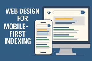
A Word about The Mobile First Design Approach
In recent years, there has been a shift towards Mobile First Design, which is an approach that prioritizes designing for mobile devices before desktop computers. The rationale behind this approach is that most internet users now access websites through mobile devices, and providing them with the best possible experience is important.
Mobile First Design involves starting the design process with the smallest screen size in mind and then progressively enhancing the layout and features as the screen size increases. This approach ensures the website is optimized for mobile devices and provides a smooth and intuitive user experience.
One of the key benefits of Mobile First Design is improved performance. By designing for mobile devices first, unnecessary elements and features can be eliminated, resulting in faster loading times and better performance on all devices.
Mobile First Design also has implications for search engine optimization (SEO). In 2015, Google announced that mobile-friendly websites would be given preferential treatment in search engine rankings. This means that websites not optimized for mobile devices may be penalized in search results. Adopting a Mobile First Design approach ensures your website is optimized for mobile devices and improves its chances of ranking well in search engine results.
Overall, Mobile First Design is a strategic approach that recognizes the growing importance of mobile devices and aims to provide the best possible user experience and search engine visibility.
Choosing the Right Design Strategy for Your Website
When deciding between Responsive Design and Adaptive Design, it is essential to consider your website's specific needs and goals.
Suppose your primary goal is to provide a seamless and consistent user experience across devices, and you value simplicity and efficiency in development and maintenance. In that case, Responsive Design may be the right choice for you. It offers a flexible and scalable solution that can adapt to any screen size or resolution, ensuring your website looks and functions properly on all devices.
On the other hand, Adaptive Design may be the better option if you have complex requirements and want more control over the user experience. It allows you to create different versions of your website for different devices, ensuring that each version is optimized for its respective device.
It is also worth considering the impact of Mobile First Design on your website. If the majority of your target audience accesses your website through mobile devices, adopting a Mobile First Design approach can help you provide the best possible user experience and improve your search engine visibility.
Ultimately, the choice between Responsive Design and Adaptive Design depends on your unique needs and goals. Please consult a web design professional to determine your website's best design strategy.